The maximum effect of a poster is a striking verbal and visual reduction to the essentials. "Like something unexpected and surprising, as a kind of optical incident ..." ... "The poster must enter the emotional sphere ... like a burglar through the window, with a crowbar in his hand ..." A.M. Cassandre
Slimy pit tea – its playtime!
An anagram is a word or phrase formed by rearranging the letters of a different word or phrase, typically using all the original letters exactly once. For example, the word anagram can be rearranged into nag a ram, or the word binary into brainy. The original word or phrase is known as the subject of the anagram. Any word or phrase that exactly reproduces the letters in another order is an anagram. Someone who creates anagrams may be called an "anagrammatist", and the goal of a serious or skilled anagrammatist is to produce anagrams that reflect or comment on their subject. Wikipedia
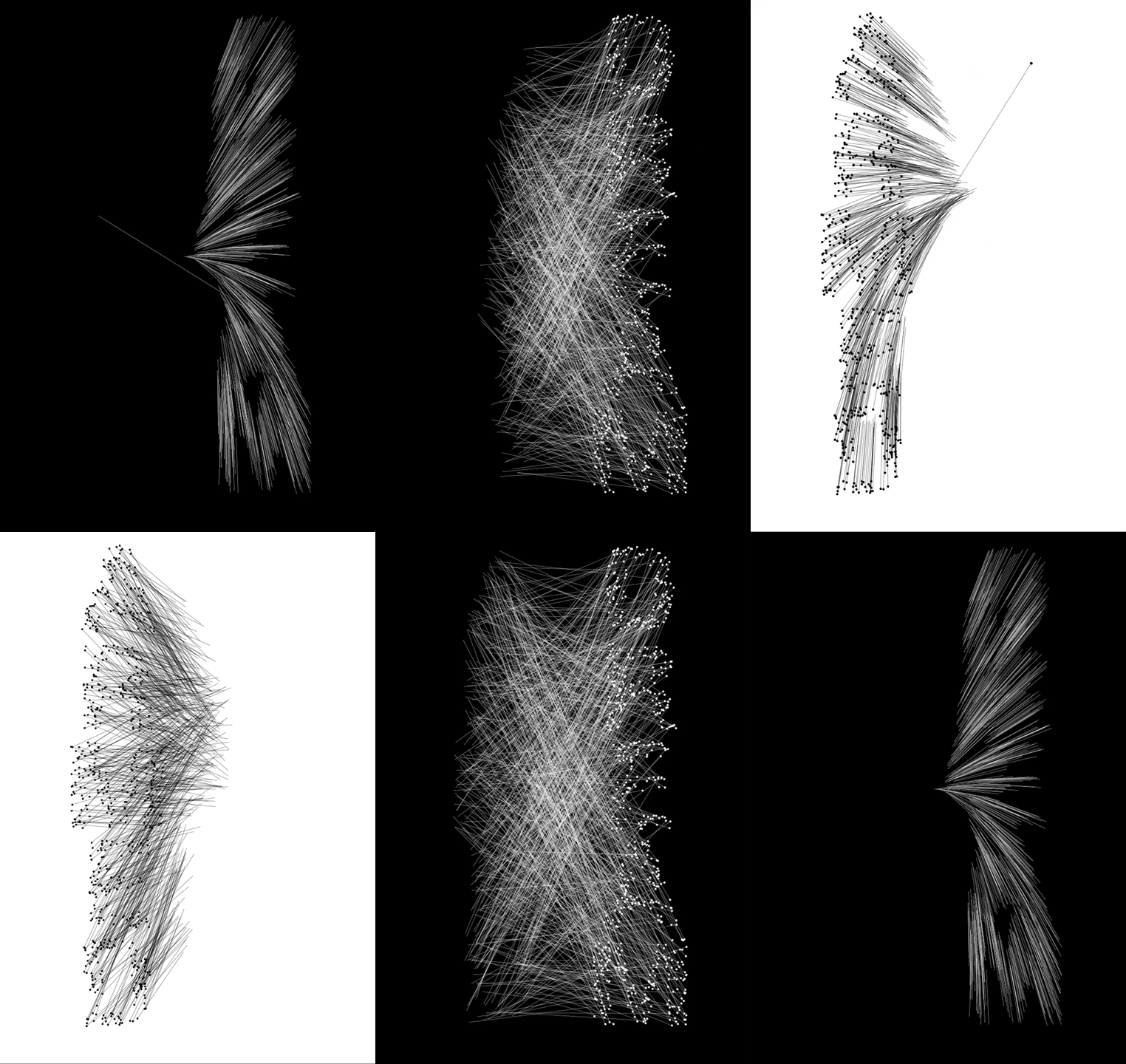
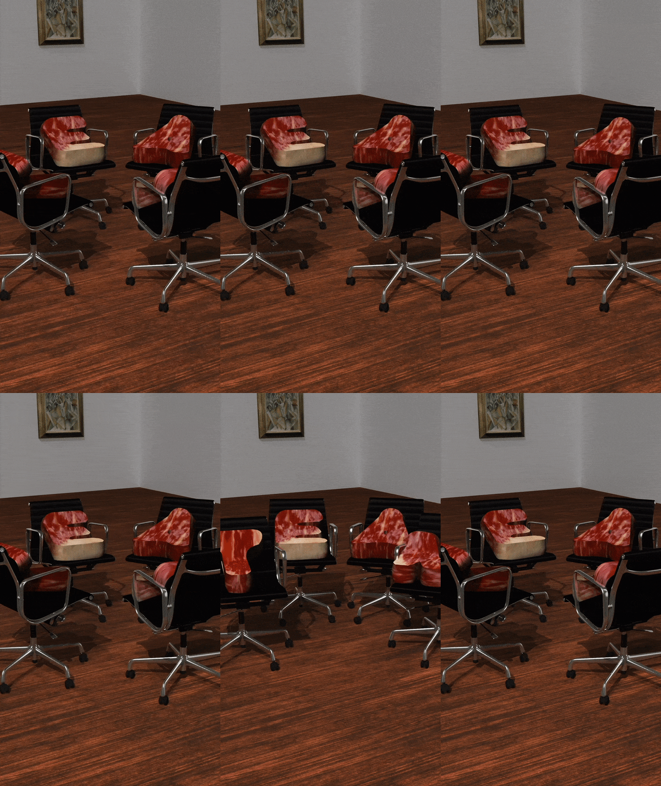
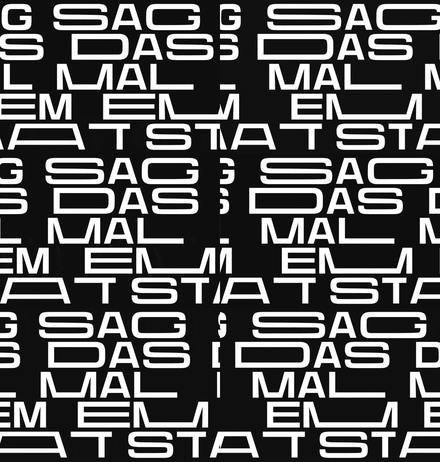
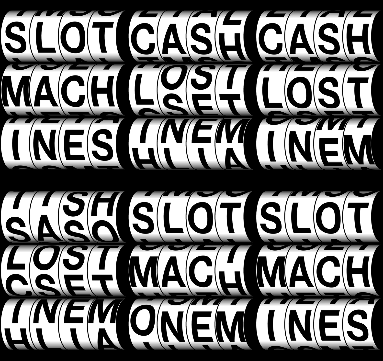
By chance, we select only one term from a dictionary. This term we supplement with two other self-selected words, generate anagrams and find the right juxtaposition. By rearranging the basic design elements (e.g., word, point, line, from,), the context changes and we provoke new products, new moving posters. The play with the coincidence and the process generates new compositions during our work. We work analog and digital.
Material to bring to the Kick-Off
Dictionary, laptop, scissors, cutter, metal ruler, pencil, Edding fat to narrow, thin, thick brush, thin brush ,USB stick, cutting pad, research material, adhesive tapes, line, Duct tape, thread, adhesive tapes, glue: Rubber Cement, sample papers, magazines / notebooks, newspapers, stencils, Letraset, stickers, colored pencils, pastel pencils, pair of compasses, triangle ruler, cardboard, rubber, Bostich, Post-it .. | Expected Products
A — 5 x Poster A3, 3 x A1,
optional: AR (artivive app)
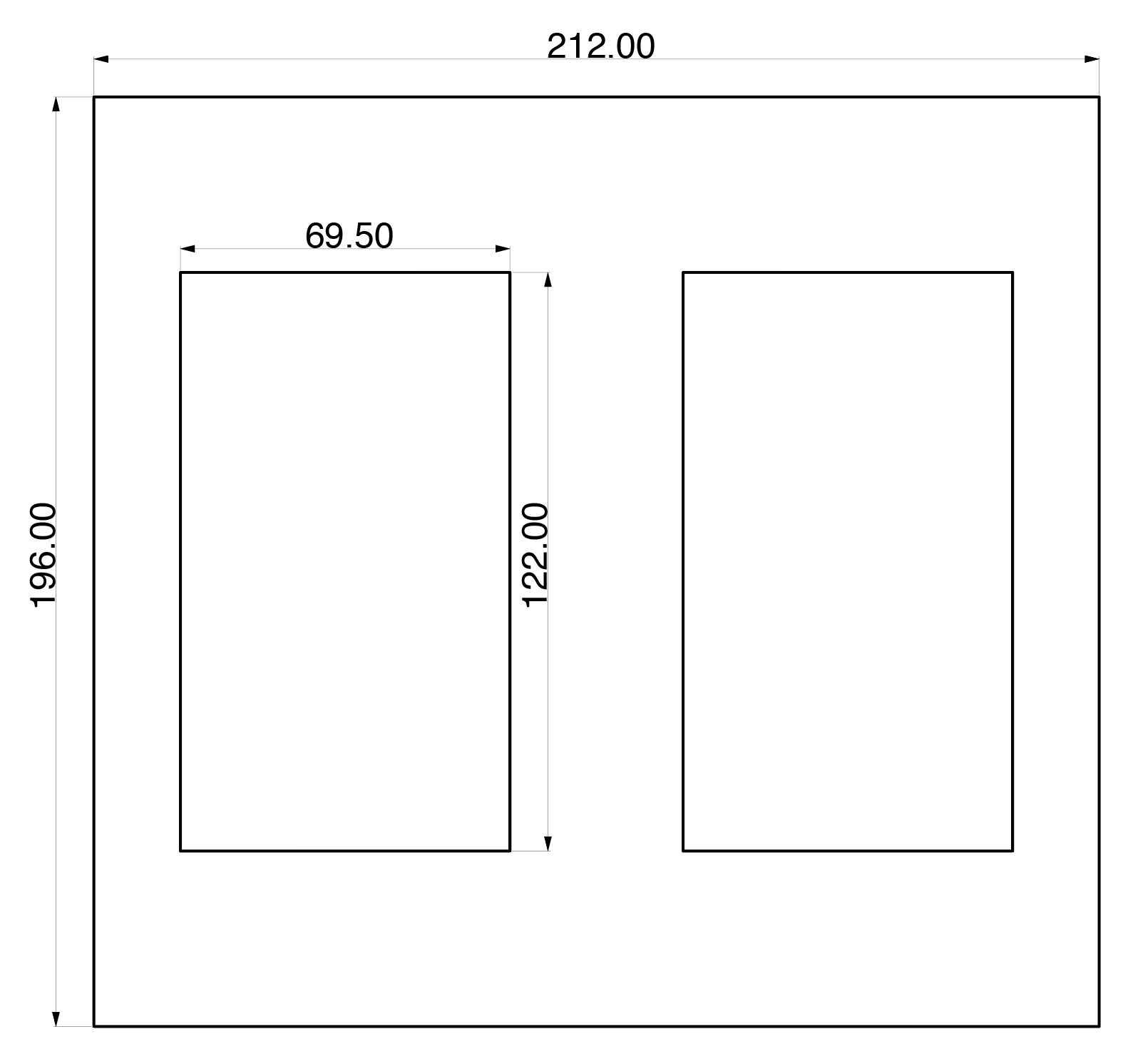
color: Black & white B — Moving Screens
2 Screens @ 45" (122cm x 69.5cm))
as one Screen:122cm x 139cm
programmed with processing C — Documentation Format:
printed & digital Fonts for use as a base:
Helvetica, Favorit oder Swiss
GT Super, Century Schoolbook MT Working form
The poster can be designed and programmed in a team (max 2 persons).
The exercises does each student individually. Learning goals
Learning goals: — playful learning
— learning by doing
— with simple methods and technics producing
a variety of material
only with letters in different fonts
— get to know and understand basic rules in composition — capture the influence of word and image
— work processively and in the format
— talk about your own work
— work alone and in team
— learning from each other Criterion of the evaluation
— design & interaction reactive wall +/- 40%
— documentations 25%
— presentations 10%
— poster prints B&W (A4, A3) 25%
and of course:
— motivation
— variety / combinations
— expressiveness and formal aesthetics
— expressiveness and formal aesthetics
— message
| Books
— Geschichte des Plakates Histoire de l‘affiche History of the poster, Josef und Shizuko Müller-Brockmann
— Generative Gestaltung entwerfen, programmieren, visualisieren, Hartmut Bohnacker, Benedikt Gross, Jul
— Postercollection, Lars Müller Publishers (verschiedene Ausgaben)
— Tissi & Odermatt, Swiss Posters, Waserverlag Zürich
— Tissi & Odermatt, Grafic Design, Waserverlag Zürich
— H. Knuchel/J. Nänni «BLUE. YELLOW. RED» colour anagrams 1991, Lars Müller
— Typo China mit einem Essay von Eva Lüdi Kong, Museum für Gestaltung Zürich, Plakatsammlung
— Posters by members of the Alliance Graphique Internationale (AGI) 1960 - 1985 ed. by Rudolph de Hara
— Plakat polski 1970-1978 [introduction: Zdzisław Schubert]
— Breaking the rules posters from the turbulent 1980s in Switzerland Plakate der bewegten 1980er Jahre
— Armin Hofmann mit einem Essay von Steven Heller, Museum für Gestaltung Zürich, Plakatsammlung
— Handmade mit einem Essay von Claude Lichtenstein, Museum für Gestaltung Zürich, Plakatsammlung
— Ralph Schraivogel mit einem Essay von Robert Massin, Museum für Gestaltung Zürich, Plakatsammlung
— Schwarz und Weiss mit einem Essay von Lars Müller Black and white with an essay by Lars Müller
— Visuelle Wahrnehmung = Visual perception, Jürg Nänni, Sulgen, Niggli
— Poemotion 3 Takahiro Kurashima, Lars Müller Publishers
— Optical Illusions and the visual arts, Ronald G. Carraher, Jacqueline B. Thurston
— Das Bild als Schein der Wirklichkeit, Herbert Schober, Ingo Rentschler, Moos Verlag München
— See waw, Hans Knuchel, Jürg Nänni, Lars Müller Publishers
Links — https://ingesanagram.appspot.com/
— Anagramm-Generator de (Wort): https://en.anagramme-expert.com/
— DE, (mehrere Wörter) http://www.anagrammgenerator.de/
— Anagramm-Generator eng: http://www.wordplays.com/anagrammer
— https://www.grillitype.com/typeface/gt-super
— https://www.abcdinamo.com/front
— https://www.linotype.com/de/1549538/egyptienne-f-schriftfamilie.html
— https://lineto.com/
— https://www.milieugrotesque.com/
— blelb ist ein Labor für Gestaltung zwischen Kunst und Technik:
http://www.blelb.ch/
— Space type Generator:
https://editor.p5js.org/full/ryzpqAjKm
— chanching Fonts
https://www.standardabweichung.de/design/projekte/html5/design-font-chemical-munich — Programming Fonts https://issuu.com/jpagecorrigan/docs/type-code_yeohyun-ahn Graphic Classics / Some Inspirations:
please google:
— Armin Hofmann
— Moholy Nagy Typography
— Wolfgang Weingart Typography
— Emil Ruder
— Koichi Sato
— Max Bill
— Ralph Schaivogel
Graphic Now / Some Inspirations:
http://dia.tv/nike-basketball/
http://www.studiofeixen.ch/
http://www.therodina.com/ecstatic-trap/
http://a-g-i.org/
http://www.johnsonkingston.ch/index.php?/do-make
http://erichbrechbuhl.ch/
http://yaherd.tumblr.com/
http://hubertus-design.ch/
http://www.ludovic-balland.com/en/poster/0/poster.html
http://www.vier5.de/10/info.html
https://www.google.ch/search?q=na+kim&espv=2&biw=
1393&bih=775&source=lnms&tbm=isch&sa=
X&ved=0ahUKEwiwxK2aztfPAhXEsxQKHetIBwQQ_
AUIBigB£
http://www.ok-rm.co.uk/cat/selected
WHICH WALLS
https://intern.zhdk.ch/?wandgestaltung
https://intern.zhdk.ch/fileadmin/data_subsites/data_serviceportal/FM-Downloads/Gestaltung_von_Waenden__Reglement_und_Anhaenge.pdf
KLEISTERN
https://www.youtube.com/watch?v=hLr-8vETkvI
A MOVING POSTER COLLECTION
http://www.themovingposter.com/—
ARTIVIVE APP
https://artivive.com/
Inspiration films ;) (concerning the theme play and coincidence )
Adriano Celentano:
https://www.youtube.com/watch?v=G96luhHhxnI
https://www.youtube.com/watch?v=-VsmF9m_Nt8
Fischli Weiss, Der Lauf der Dinge:
https://www.youtube.com/watch?v=L_HWDQxcngE
Michelangelo Antonioni, Professione Reporter, Final Scene :
https://www.youtube.com/watch?v=pvbqy8FZq8Y |

IITypo & Icons
Rebecca Morganti-PfaffhauserIn the second part of GDB you will go with a chosen style on a virtual Citytrip. You first dive in to the worlds of brands. Second you will choose one brand and then get to know it. Third: you design a city guide with the look of your chosen brand. A
Explore 2 brands that have a strong and clear visual identity which you like allot. These brands can come from fashion, visual designers, search engines, automotives, places, newspapers, events etc. Create a moodboard (A4 landscape format) with the essential, visual parameters from each of the 2 brands, from which the look & feel of the brand is readable. Contents
1 word mark, figurative mark or word/figurative mark, Title
2 primary colors and secondary colors of the corporate design
3 fonts of corporate design
4 corporate design elements
5 materiality of the products
6 design language of the products
7 images
8 Find the used fonts and name the font, font style and the application area.
Example tools
www.myfonts.com/WhatTheFont
www.identifont.com
9 ... B
Select one brand of phase A. Explore for the following terms pictograms and / or icons. Design at least 5 pictograms to each term which fit to the chosen brand. First create analog sketches, then convert the icon families digitally with Illustrator. 1 hotel
2 dinner / meal
3 coffee
4 nightlife
5 now
6 entertainment
7 discover
8 visitor attraction / sight
9 map C
Create a City Guide with the look and feel of your selected brand. It is important to notice the brand, but not by the frequent placing of the logo, but by applying the visual parameters such as fonts, colors, elements etc. — Home / Welcome screen
— City Screen
— Discover Screen
— Map
— ...
| 
Expected Products
A —Moodboard
A4 landscape format
printed & digital B — Icon families
A4 portrait format
printed & digital C — City guide design
A4 portrait format
printed & digital
(one page, full size A4) Working form
The exercises does each student individually. Learning goals
— get to know brands
— appearances of brands
— simple layouts
— basic icon / pictogram design
— first steps screendesign mobile Criterion of the evaluation
— design icons / icon families +/- 40%
— design city guide +/- 30%
— design mood board +/- 10%
— presentations +/- 10%
— documentations +/- 10%
|  
Books:
— Zeichensysteme der visuellen Kommunikation: Handbuch für Designer, Architekten, Planer, Organisatoren, 1. Januar 1996 von Otl Aicher(Autor), Martin Krampen(Autor)
|
![]()
